Hello Friends! On the iPhone 14 Pro, Apple had a surprise in store for us: we went from the notch to an elongated perforation that transforms to show us contextual information, which is able to show what song we are playing or multimedia playback. Apple has called this the dynamic island and it obviously didn’t take long for someone to come up with the idea of duplicating it on Android. The new iPhones were launched during the month of September. And we already have an app to have the dynamic island of the iPhone on Android that works quite well. The only detail: it’s in Chinese, but even for that the community has already found a workaround.
Install Smart Bird
Interested in having an dynamic island on your Android phone? Time will tell if Android manufacturers will decide to include something similar in future versions -probably yes- but for now you’ll have to settle for getting something similar with applications. As time goes on, these types of apps are becoming more and more polished and provide us with an experience that really is similar to what we have iOS 16.
As of today, the best alternative to the dynamic island for Android is Smart Bird, a Chinese app that is still only available in Chinese. Don’t let that discourage you, the app is quite simple to use, even if you don’t understand anything. In addition, someone has bothered to translate the app into English unofficially.
Download original Smart Bird (in Chinese)
Download modified Smart Bird (in English)
Add permissions
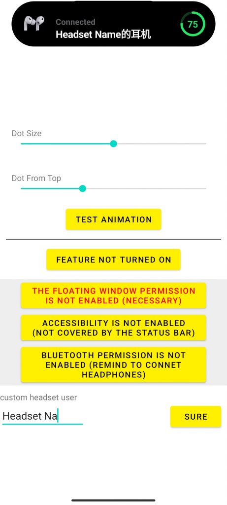
Open the application and you will find a series of sliders at the top and then red or orange buttons. These red buttons indicate the status of the configuration and that you still have to grant certain permissions.
The first permission you will have to grant is to display on top of other applications, which is obvious as the island graphics should overlay everything else. If you click the first button in red starting with the (!). Just the button below it allows you to accept the accessibility permission for the application, although this seems to be optional.
Finally, the last button below it allows you to give the app permission to find nearby devices. This is used to show a notification when headphones are nearby, for example.

Configure your island
With all permissions set, the button with the play icon turns green and includes the text All done, have fun, but it is possible that the “island” of the app does not match our camera. We can adjust it with the four sliders at the top. These are the options in order from top to bottom:
- Height
- Width
- Distance from the top edge
- Distance from the side
In addition, with the three buttons at the top you can choose where your camera punch is: on the left, centered or on the right.
Enjoy!

You’re all set. Don’t expect a full alternative to Apple’s dynamic island yet, but do expect the camera perforation to come to life from time to time to show you information. You can test it when you plug in a headset or when you put your phone on charge.

Considering that it hasn’t even been a month since we got first-hand knowledge of the iPhone’s dynamic island, the implementation is pretty good, beyond the language issue.


